
The Good
Let’s get the easy stuff out of the way: The high refresh-rate screen and high resolution cameras are clearly superior to what anyone might be upgrading from. I’m very thankful that Apple and Samsung are FINALLY getting on the higher refresh bandwagon. Moving from 85hz CRT to 60hz LCD was noticeable back in the early 2000s. I can appreciate the benefit of a higher quality front-facing selfie camera. I did not get a chance to test any of the cameras, but I’m sure they are great. 9 out of 10.
The Bad
I want a single main camera on the back. Anything more is a waste of my money and my attention. I don’t have any time or attention to deal with switching between cameras. If I did, I would pull out a DSLR. The point of a camera on a phone is to take quick shots in the moment, dealing with a poorly designed camera app’s ‘pro’ mode is a tax on my sanity I wish not to pay. Failure to understand obvious common use cases at a huge cognitive and financial expense to the consumer; 2 out of 10.
The Ugly
The first thing you’re subjected to when you turn on the phone is page after page of legal terms and conditions. These use dark patterns to get you to agree to terms and conditions that are optional. Additionally, I would guess more than 90% of users have already agreed to these terms on their previous device. There are FULL PAGE lists of terms from Google, then Samsung, then ATT. On some, when you try to skip the optional terms, there’s a huge warning of things you’re going to miss out on. This is disgusting. These legal terms are not comprehensible by consumers. Heck, even attorneys can’t understand these terms. Hundreds of pages of legalese that are comprehensible to exactly zero people is a fall-flat-on-your-face failure: 0 out of 10.
After agreeing to all the required terms, you’re asked to log in to all your accounts. Not all your google accounts, but Google, Samsung, and ATT. This should not be part of the system-modal setup process. Each one you have to skip and again get subjected to ARE YOU SURE YOU DON’T WANT ALL THESE GREAT BENEFITS!? Even worse, Google followed up with a spam email (Including a gaudy emoji!) to finish the process. It's not even the consumer-facing model number. Exploiting human psychology for personal greed: 0 out of 10.

When you finally make it to the home screen, there’s a huge flurry of non-dismissible notifications about finishing setup, installing updates, and syncing accounts. The flurry is disorienting and the ‘complete setup’ notification being non-dismissible is frustrating. The flurry of updates mean the phone is using a lot of bandwidth and CPU power right at the most critical moment: unboxing. This scenario occurs in 100% of cases. This is an enormous QA failure: 0 out of 10.
Shortly after you realize the home screen and app drawer are filled with garbage shovel-ware from Google, Samsung, and ATT. About half of these applications cannot be uninstalled or disabled. From my experience, some of these applications even exploit this uninstallability to send advertising notifications. Jailbreaking a phone to get arround these issues is almost definitely against the DMCA and thus illegal. Trapping the user like this is shockingly unethical: 0 out of 10.
Presumably, largely thanks to Apple and the power of newer devices, ‘user experience’ features like blur, translucency, and animations are now pervasive. Except for blur, these features and embellishments can be hugely advantageous to usability. Unfortunately, Apple and Google have largely put more focus on visual appeal and oohs-and-aahs than usability. As a prime example, Apple has a added settings to disable translucency and motion because users get physically sick when subjected to these features. Additionally, the transitions are often physically disorienting because they convey physical movement that is either impossible or immediately self contradictory (think a screen sliding toward the top of the screen then coming back from the bottom). Embarrassingly these settings are swept into the accessibility settings. Last time I checked, disabling bad design was not an accessibility concern. Somewhat less disorienting is the fact phone applications run full screen, so there’s very little context conveyed. Animation has helped a little here. Giving Google and Apple the benefit of the doubt, I suspect translucency was an attempt at giving context, but this lead to contrast issues and may explain the advent of the blur effect now used on both platforms. But this blur effect makes me physically ill, likely because my eye’s consider it something they need to correct via focus but cannot. Additionally, it’s implemented in a physically-impossible presentation. Google allows animations to be disabled completely, but one cannot selectively disable the bad animations and leave helpful ones. Worse, Google does not offer a way to disable blur or translucency. I find making a computer UI that makes users physically ill a complete and utter failure. 0 out of 10.
This brings us to the physical design. While setting up my accounts, I needed to look up a password in my password manager. I gently placed the hefty phone on my desk, opened the password manager, found the password, then gently picked the phone back up to enter it into the text field. While picking up the phone, the apparently ultra-sharp bezel scraped the surface of my desk. It felt like fingernails on a chalk board. I turned the phone over and discovered it had scraped off the finish of my desk. Apparently the back of the phone has a bezel that is a literal physical hazard. Unbelievable. 0 out of 10.
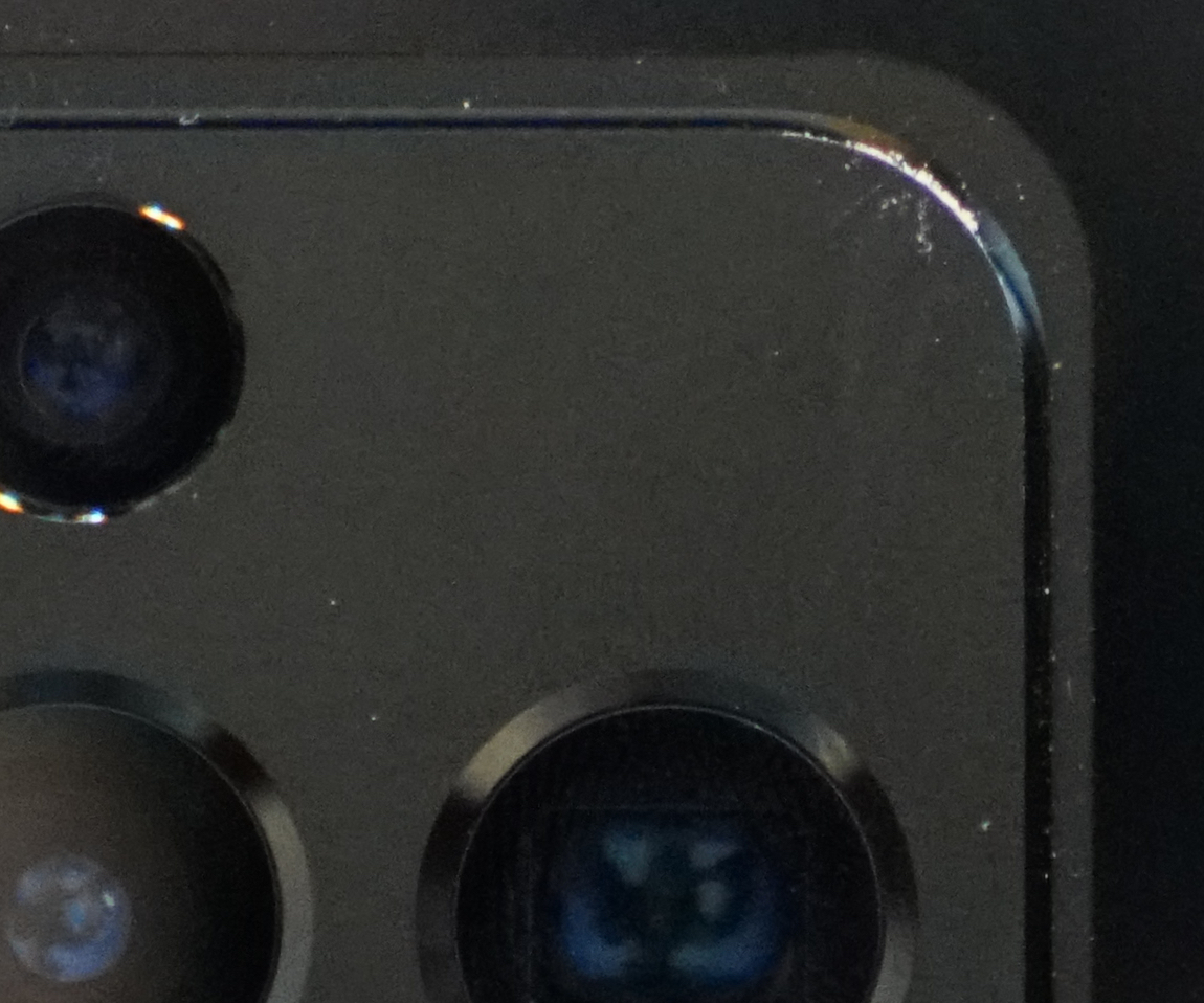
The white crud here is the finish of my desk this phone scrapped off when it was in gentle, momentary contact
Six years or more after its introduction, the phone still has a pointless curve on it that constantly creates false-positive touch screen interactions because human flesh, required to supply enough friction to hold the phone and prevent it from falling, comes in contact with the screen there; worse, the flesh occludes portions of the screen. Additionally, there is still a ridiculous pinhole for the front facing camera that cuts out of all content that is displayed on the device to no benefit except marketing bullet points for screen coverage. There have been numerous generations of the phone since this problem would have been woefully apparent. There is no excuse any more, 0 out of 10.
I managed an $800 trade in value for a phone I paid $350 for a year ago, so really this is only costing me $400 for a flagship phone, $750 if you include the cost of replacing the trade-in. That sure sounds like a pretty good deal...
Verdict: Disgusted; Google, Samsung, and ATT should be ashamed. The device unconditionally makes the user physically ill and permanently damages any surface it’s put in contact with. On top of that, it’s been intentionally designed to exploit human behavior for personal greed. 100% of QA testers should have experienced this same outcome with minimal effort. I’m returning it.